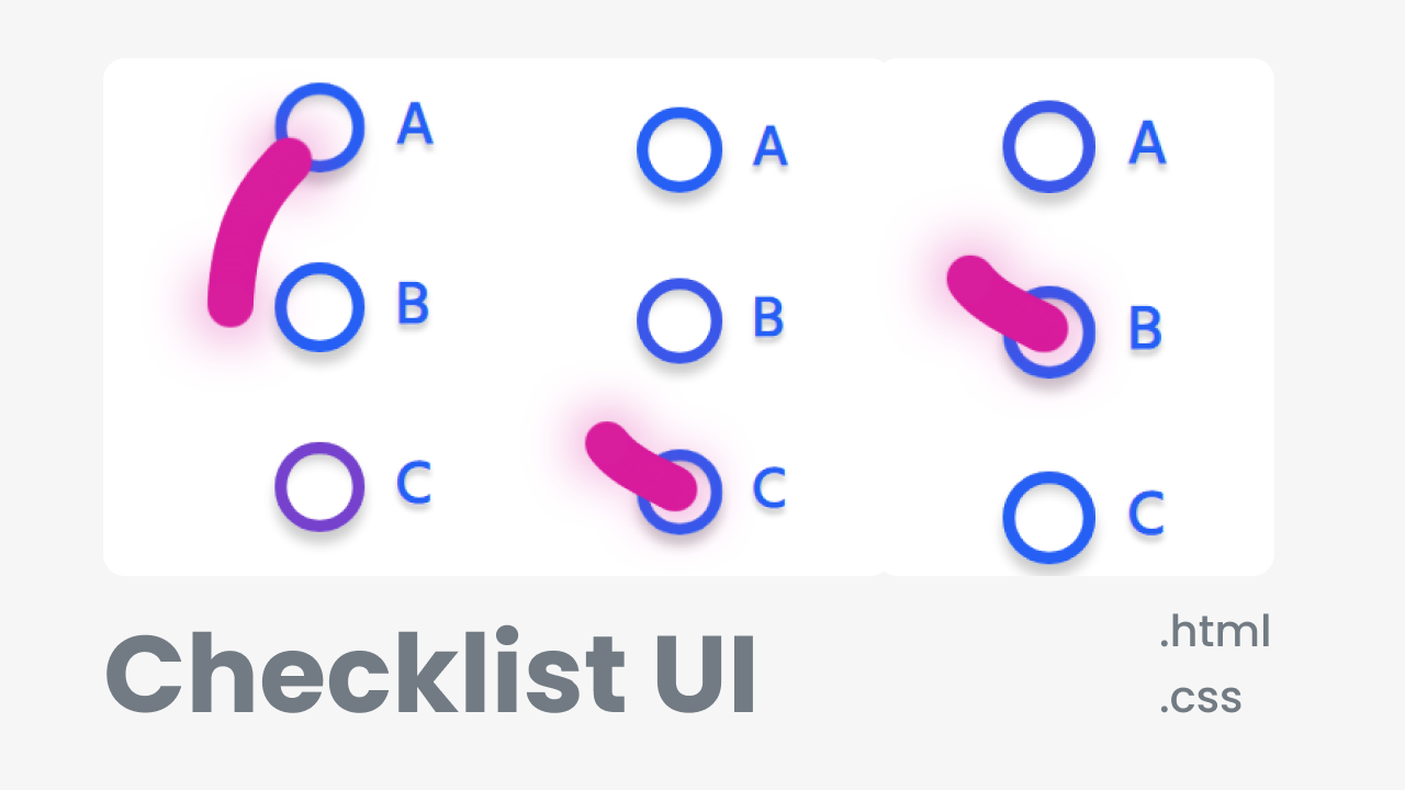
Checklist UI Using html-css

Creative Checklist UI Using html-css with Source code free download.
81 min read
Checklist UI


<!-- Created by CodingHindi--->
<form>
<input id="a" type="radio" name="hopping" value="a" checked>
<label for="a"><span></span>A</label>
<input id="b" type="radio" name="hopping" value="b">
<label for="b"><span></span>B</label>
<input id="c" type="radio" name="hopping" value="c">
<label for="c"><span></span>C</label>
<div class="pio">
<div class="pio__segment"></div>
</div>
</form>
view raw index.html hosted with ❤ by GitHub
/*-- Created by CodingHindi---*/
* {
border: 0;
box-sizing: border-box;
margin: 0;
padding: 0;
}
:root {
font-size: calc(32px + (40 - 32)*(100vw - 320px)/ (1024 - 320));
}
body {
background: #e3e4e8;
color: #255ff4;
display: flex;
font: 1em Hind, sans-serif;
height: 100vh;
line-height: 1.5;
padding: 1.5em 0;
}
form {
display: block;
margin: auto;
max-width: 10em;
position: relative;
}
input {
position: fixed;
top: -1.5em;
left: -1.5em;
}
label {
cursor: pointer;
display: block;
font-weight: bold;
text-shadow: 0 0.1em 0.1em rgba(0, 0, 0, 0.2);
transition: color 0.2s cubic-bezier(0.45, 0.05, 0.55, 0.95);
}
label:not(:last-of-type) {
margin-bottom: 1.5em;
}
label span {
box-shadow: 0 0 0 0.2em currentColor inset, 0 0.2em 0.2em rgba(0, 0, 0, 0.2), 0 0.3em 0.2em rgba(0, 0, 0, 0.2) inset;
display: inline-block;
margin-right: 0.5em;
vertical-align: bottom;
width: 1.5em;
height: 1.5em;
transition: transform 0.2s cubic-bezier(0.5, 0, 0.5, 2), box-shadow 0.2s cubic-bezier(0.45, 0.05, 0.55, 0.95), color 0.2s cubic-bezier(0.45, 0.05, 0.55, 0.95);
}
label span,
.pio__segment:before {
border-radius: 50%;
}
input:checked + label,
input:checked + label span,
.pio__segment:before {
color: #d81d9d;
}
input:checked + label, input:checked + label span {
transition-delay: 0.4s;
}
input:checked + label span {
transform: scale(1.2);
}
.pio {
top: 0.375em;
left: 0.375em;
}
.pio, .pio__segment {
position: absolute;
}
.pio__segment {
top: 0;
left: 0;
width: 0.75em;
height: 0.75em;
transition: transform 0.4s cubic-bezier(0.45, 0.05, 0.55, 0.95);
}
.pio__segment:before {
animation-duration: 0.4s;
animation-timing-function: cubic-bezier(0.45, 0.05, 0.55, 0.95);
background: currentColor;
content: "";
display: block;
width: 100%;
height: 100%;
}
.pio__segment:first-child:before, .pio__segment:last-child:before {
box-shadow: 0 0 1em 0 currentColor;
}
.pio__segment:nth-child(2) {
transition-delay: 0.004s;
}
.pio__segment:nth-child(2):before {
animation-delay: 0.004s;
}
.pio__segment:nth-child(3) {
transition-delay: 0.008s;
}
.pio__segment:nth-child(3):before {
animation-delay: 0.008s;
}
.pio__segment:nth-child(4) {
transition-delay: 0.012s;
}
.pio__segment:nth-child(4):before {
animation-delay: 0.012s;
}
.pio__segment:nth-child(5) {
transition-delay: 0.016s;
}
.pio__segment:nth-child(5):before {
animation-delay: 0.016s;
}
.pio__segment:nth-child(6) {
transition-delay: 0.02s;
}
.pio__segment:nth-child(6):before {
animation-delay: 0.02s;
}
.pio__segment:nth-child(7) {
transition-delay: 0.024s;
}
.pio__segment:nth-child(7):before {
animation-delay: 0.024s;
}
.pio__segment:nth-child(8) {
transition-delay: 0.028s;
}
.pio__segment:nth-child(8):before {
animation-delay: 0.028s;
}
.pio__segment:nth-child(9) {
transition-delay: 0.032s;
}
.pio__segment:nth-child(9):before {
animation-delay: 0.032s;
}
.pio__segment:nth-child(10) {
transition-delay: 0.036s;
}
.pio__segment:nth-child(10):before {
animation-delay: 0.036s;
}
.pio__segment:nth-child(11) {
transition-delay: 0.04s;
}
.pio__segment:nth-child(11):before {
animation-delay: 0.04s;
}
.pio__segment:nth-child(12) {
transition-delay: 0.044s;
}
.pio__segment:nth-child(12):before {
animation-delay: 0.044s;
}
.pio__segment:nth-child(13) {
transition-delay: 0.048s;
}
.pio__segment:nth-child(13):before {
animation-delay: 0.048s;
}
.pio__segment:nth-child(14) {
transition-delay: 0.052s;
}
.pio__segment:nth-child(14):before {
animation-delay: 0.052s;
}
.pio__segment:nth-child(15) {
transition-delay: 0.056s;
}
.pio__segment:nth-child(15):before {
animation-delay: 0.056s;
}
.pio__segment:nth-child(16) {
transition-delay: 0.06s;
}
.pio__segment:nth-child(16):before {
animation-delay: 0.06s;
}
.pio__segment:nth-child(17) {
transition-delay: 0.064s;
}
.pio__segment:nth-child(17):before {
animation-delay: 0.064s;
}
.pio__segment:nth-child(18) {
transition-delay: 0.068s;
}
.pio__segment:nth-child(18):before {
animation-delay: 0.068s;
}
.pio__segment:nth-child(19) {
transition-delay: 0.072s;
}
.pio__segment:nth-child(19):before {
animation-delay: 0.072s;
}
.pio__segment:nth-child(20) {
transition-delay: 0.076s;
}
.pio__segment:nth-child(20):before {
animation-delay: 0.076s;
}
.pio__segment:nth-child(21) {
transition-delay: 0.08s;
}
.pio__segment:nth-child(21):before {
animation-delay: 0.08s;
}
.pio__segment:nth-child(22) {
transition-delay: 0.084s;
}
.pio__segment:nth-child(22):before {
animation-delay: 0.084s;
}
.pio__segment:nth-child(23) {
transition-delay: 0.088s;
}
.pio__segment:nth-child(23):before {
animation-delay: 0.088s;
}
.pio__segment:nth-child(24) {
transition-delay: 0.092s;
}
.pio__segment:nth-child(24):before {
animation-delay: 0.092s;
}
.pio__segment:nth-child(25) {
transition-delay: 0.096s;
}
.pio__segment:nth-child(25):before {
animation-delay: 0.096s;
}
.pio__segment:nth-child(26) {
transition-delay: 0.1s;
}
.pio__segment:nth-child(26):before {
animation-delay: 0.1s;
}
.pio__segment:nth-child(27) {
transition-delay: 0.104s;
}
.pio__segment:nth-child(27):before {
animation-delay: 0.104s;
}
.pio__segment:nth-child(28) {
transition-delay: 0.108s;
}
.pio__segment:nth-child(28):before {
animation-delay: 0.108s;
}
.pio__segment:nth-child(29) {
transition-delay: 0.112s;
}
.pio__segment:nth-child(29):before {
animation-delay: 0.112s;
}
.pio__segment:nth-child(30) {
transition-delay: 0.116s;
}
.pio__segment:nth-child(30):before {
animation-delay: 0.116s;
}
/* States */
input:nth-of-type(1):checked ~ .pio .pio__segment:before {
animation-name: hop1;
}
@keyframes hop1 {
from, to {
transform: translateX(0);
}
50% {
transform: translateX(-1.5em);
}
}
input:nth-of-type(2):checked ~ .pio .pio__segment {
transform: translateY(3em);
}
input:nth-of-type(2):checked ~ .pio .pio__segment:before {
animation-name: hop2;
}
@keyframes hop2 {
from, to {
transform: translateX(0);
}
50% {
transform: translateX(-1.5em);
}
}
input:nth-of-type(3):checked ~ .pio .pio__segment {
transform: translateY(6em);
}
input:nth-of-type(3):checked ~ .pio .pio__segment:before {
animation-name: hop3;
}
@keyframes hop3 {
from, to {
transform: translateX(0);
}
50% {
transform: translateX(-1.5em);
}
}
/* Dark mode */
@media screen and (prefers-color-scheme: dark) {
body {
background: #17181c;
color: #e3e4e8;
}
input:checked + label,
input:checked + label span,
.pio__segment:before {
color: #5583f6;
}
}
view raw style.css hosted with ❤ by GitHub
Checklist UI.zip 2.64kb

Post a Comment